This is an extract from Sin City, a graphic novel series by Frank Miller. Which is one of my all time favorites and the series that dragged me into the whole comic thing. Frank Miller is a writer fabled for his prowess with writing dark storylines with awesome one liners but never being able to write a woman who wasn't a whore with a heart of gold (or just a whore..) but with Sin City he just takes all of that in his stride.
The story is based around 3 male characters who take their personalities from the very heart of American Film Noir. You've got the well meaning thug who is haunted by the thoughts of the woman he loved who was killed, the hero cop who was screwed over and is out for revenge and the not-so-white knight standing up for the women of the city. These various storylines all link up and cross over in various places, again this is told in the Film Noir style non-linear story telling.
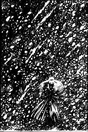
But great storyline's aside what always grabs me about this run of novels is Miller's art work. The image I've included here demonstrates it. Miller uses black and white very well in order to create his world, you only ever see one colour in a frame where he wants emphasis on something. The black and white intrigues me because if you look at it too long you start to see what it really is, just a few indiscriminate shapes on a page, but (like Julian Opie's work) the brain jumps in and fits the pieces together to give a really striking image.
What always gets me is how he can include this level of detail into his work, using only black and white. I mean, everything looks amazingly well drawn and you never find yourself looking at a scene trying to work out what's going on (which can happen a lot with full colour comics.)

No comments:
Post a Comment